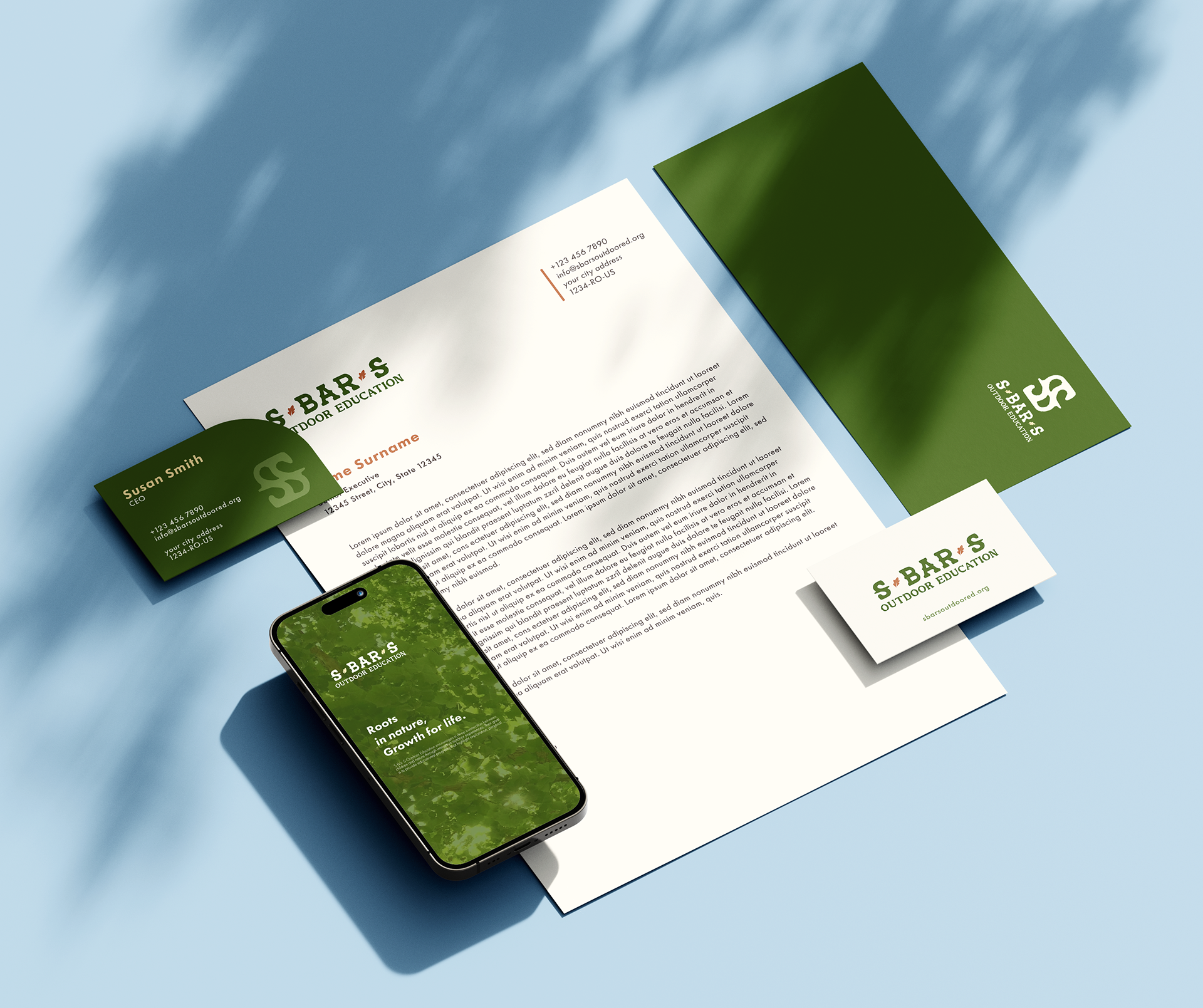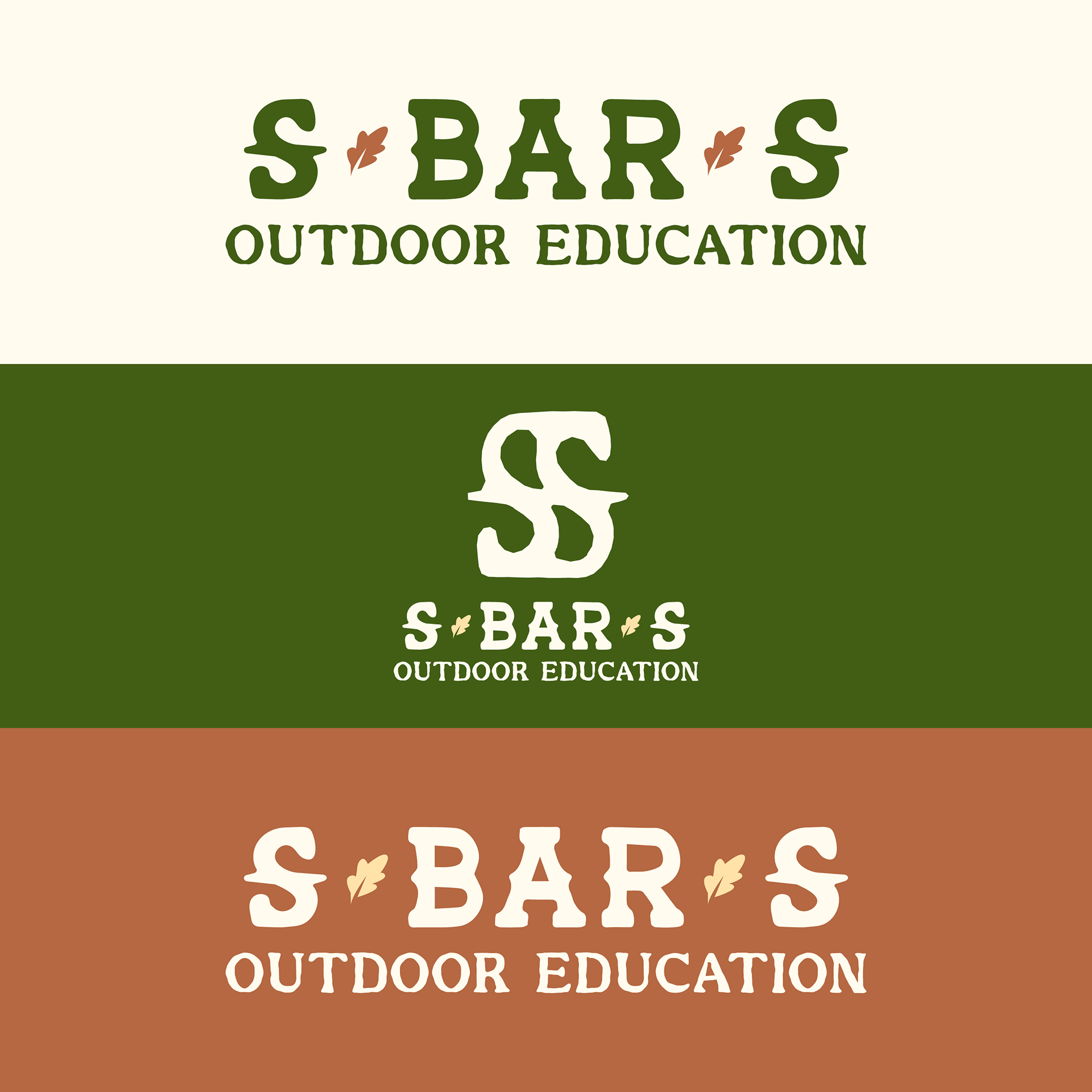

The S Bar S Outdoor Education logo redesign was all about creating a clear, versatile, and nature-inspired identity that aligns with the organization’s mission. As a nonprofit dedicated to outdoor education, S Bar S needed a logo that captured both its scientific and faith-based approach to nature learning while remaining readable and scalable across digital and print formats.
To reflect the organization’s roots in hands-on ecological education, I incorporated an oak tree as the central element, symbolizing growth, knowledge, and stability. Stars and subtle nature motifs were added to enhance the outdoor theme. For typography, I chose a bold slab serif with a western feel, tying into the organization’s future branding plans and potential ranch expansion. The color palette maintains earthy tones with a touch of maroon for warmth and contrast.
This project challenged me to balance heritage with modern adaptability, ensuring the logo is not only visually compelling but also practical for t-shirts, letterheads, and digital applications. The final design provides S Bar S with a strong and cohesive identity that will support its growth and outreach for years to come.
